Fine Print Workshop Notes
From My Fine Print Workshops
©Copyright 1997 thru 2008 David Kachel
Article Has Never Been Published. It has previously been used only for workshop instruction.
(You may print 1 (ONE) copy of this article for your personal use. No other reproduction, distribution or other use of any kind is authorized. If you have a friend with whom you wish to share this information, your friend must visit this web site to get the article. You may NOT give it to another person.)
These notes must be read before your first day of the Fine Print workshop. Previously, the content of these notes was part of the lecture material presented during the first day of the Fine Print workshop. However, by putting most of the more mundane aspects of that lecture information into these notes and making them required reading before the start of the workshop, we are able to devote significantly more of the available workshop hours to producing prints.
Prior to the preparation of these notes, lecture time in the Fine Print workshop was slightly more than one day. Now, lecture time is cut to less than half a day and the remainder of the five-day workshop is spent printing — a significant improvement. However, thorough familiarity with the contents of these notes is very important — What you haven’t read (Yes, I will notice!) will have to be covered in the workshop to the inconvenience and annoyance of everyone. Please don’t forget!
What this article is about…
This article contains general information about the hardware and materials used in the print-making process. Except where otherwise noted, none of the information contained here should necessarily be taken as an indication of what kinds of materials you should buy. Rather, this is simply an attempt to make you aware and knowledgeable of what is available and how it may best be employed.
In general, there are just four basic types of structural enlarger design… single column, double column, wall mounted and floor mounted. The most common of these is the single column variety, though due to the popularity of Beseler’s 23 and 45 series enlargers, the double column variety is not very far behind. Wall mounted enlargers are uncommon and are usually just standard single, or double column enlargers with special brackets for wall mounting. Their only significant advantage is that being wall mounted, they free up a small amount of darkroom space. However wall mounted enlargers tend to be unstable to the degree that the wall to which they are attached is unstable. (Often very much so.)
All varieties of enlarger mentioned above can be of stable construction. However, most single column enlargers, simply because it is this variety that is most often manufactured for the hobbyist, are unreliable from the standpoint of stability. Only the larger, professional models of single column enlargers are sufficiently stable to be relied upon for serious print making.
What do I mean by “stability?” Simple… is the enlarger easy to set into motion? Does it vibrate, bend, wobble or shift position easily? Does the entire enlarger shake or move when you move the head up and down? Does the position of the head, relative to the enlarger chassis, change in any way? i.e.. Does it tilt from side to side or back to front? A rickety enlarger will be a nightmare to work with. If yours is not rock solid, get rid of it!
It is simpler to construct anything with two supports, rather than just one and enlargers are no exception. In general, two column enlargers are more stable than the single column variety, though there are certainly a number of very stable single column enlargers available.
From the standpoint of stability, you are generally quite safe with any enlarger designed for professional or advanced amateur use. Always buy an enlarger that will handle one film format size larger than the maximum size you expect to print (unless of course you are printing 4x5). Used enlargers can certainly be a bargain, but they are often too unstable due to age and use to be of any practical value. It is very common for used enlargers to be out of alignment and too feeble to be realigned or remain in alignment. There is nothing more frustrating than trying to make a serious print, all the while having to fight with an unstable enlargerinstead of paying attention to the aesthetics of what you are doing.
If you can afford a new enlarger, buy one. The savings on a used enlarger are very often false economy. If you must buy a used enlarger, take a level with you and be VERY particular. If it is not rock solid and 100% in alignment, don’t buy it.
Since the subject of this workshop is B&W print making, the discussion here will deal with enlarger heads only as they relate to B&W printing. There are two basic classes of enlarger heads — focused light heads and diffusion heads. These terms are largely self-explanatory but a brief description may help.
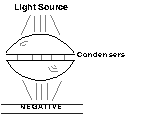
Focused light heads are those which employ lenses (called condensers) to focus light from a small lamp onto a negative. Diffusion heads are designed to provide a large diffuse light source, as big or bigger than the negative, so that illumination of the negative is more even and less harsh.
There are then two sub-classes of enlarger head: those that produce illumination from a hot lamp source (hot light heads), and those that produce illumination from a cold lamp source (cold light heads). The former produces a lot of heat while in operation, the latter produces little or none. All focused light heads are also hot light heads. Diffuse light enlarger heads on the other hand can be either hot or cold light heads.
Categorized by the two classes mentioned above, there are six enlarger head varieties;
Condenser heads are quite simple and a very old (19th century) design. They consist simply of a light source, usually a simple tungsten lamp, and two large lenses, called condensers, that focus the light from the lamp onto the negative. The reason for the condensers is simply to provide more efficient use of the light produced by a relatively weak lamp.
The problem with condenser light sources is that they tend to produce more problems than they solve.
Because light is focused by the condensers, any debris on the top or bottom of the negative is likely to also be in focus. Therefore, with these heads, there is a serious problem with dust showing up in prints, which results in a tremendous amount of extra work at the spotting stage. The problem can be reduced by keeping the condensers clean. However, this means constant, not just occasional cleaning, and even then is only marginally successful.
Condensers also tend to be poorly made. This results in a high number of flaws in the condenser glass. Bubbles and other artifacts in the condensers tend to show up in prints, particularly in smooth even-toned areas of the print.
In defense of condenser heads, it is often claimed that they are “sharper” than cold light or diffusion heads. On paper this is true. From a practical standpoint, it is not. I have never been able to see a demonstrable improvement in sharpness from a condenser head over a diffusion head. From a practical standpoint (i.e., we are interested in making photographs), if it can’t be seen in a print, it doesn’t exist.
Another point sometimes made in favor of condenser heads is that they can provide higher contrast than a diffusion head. This is true. A condenser head will provide about one grade more contrast from any given negative than will a diffusion head. From a practical standpoint however, the occasional need for a higher maximum printing contrast does not justify having to deal with all the problems caused by a condenser head on a daily basis.
The increased contrast produced by condenser heads has been attributed to something known as the Callier Effect. In recent years this theory has lost credibility and I therefore won’t go into the details here. It’s important only that we know condenser heads exhibit higher contrast.
Yet another problem with condenser heads is that they produce a lot of heat. This heat tends to be transferred to the negative where it results in the negative expanding and suddenly bowing upwards (commonly referred to as “popping”) and out of focus. With condenser head enlargers it is unusual NOT to have a negative pop out of focus numerous times during printing. This makes printing with a condenser head an exercise in frustration no matter how well made or clean the condensers may be.
In short, condenser heads have few if any advantages, save that they are cheaper than any other type of head, and suffer from a number of serious drawbacks, most having to do with print quality and ease of work.
Point-Source enlarger heads are simply condenser heads on steroids! They are based on the idea that the smaller the light source itself, the more efficiently light will be focused and these heads therefore have a single, very small and powerful lamp. Point-source heads are indeed very efficient and there is even a noticeable improvement in image sharpness when a point-source head is used.
However, point-source heads magnify the problems of condenser heads considerably and therefore are not practical for day-to-day printing. Their best use is for business or scientific purposes where the need to see fine detail outweighs the desire for aesthetic quality in a print.
The cold light head is the hands-down favorite among fine-art photographers. They are inexpensive, efficient and have none of the problems associated with condenser heads.
Cold light heads consist of a small fluorescent light tube bent into a grid shape. The grid rests above a diffuser made from white plexiglass-like material. This combination is placed right over the negative so that the plexiglass is very nearly in contact with the negative.
The advantages to cold-light illumination for enlarging are numerous. First there is no significant amount of heat produced by cold light heads, so popping is virtually unheard of.
Illumination tends to be far more even with cold light (and other types of diffusion) heads and therefore less work is required to print the negative.
Since the light from a cold light head is not focused, the only thing in the light path that is brought into sharp focus is the emulsion surface of the film itself. Debris on top of the negative and inside the enlarger headare far less likely to be in focus and therefore prints made with cold light heads require much less spotting.
Cold light heads produce light very efficiently and therefore are usually faster than condenser heads. But all is not roses. Cold light heads do have some disadvantages as follows:
Though the term is “cold light,” these heads do of course produce some heat and as the lamp warms up, the efficiency of light production improves. This means that if you make two ten-second-exposure prints in a row, the second print will receive more exposure than the first because the lamp will still have been warm from the first exposure and will therefore produce light more efficiently during the second exposure. This can be a problem when trying to print consistently (no, the commercial products designed to handle this problem apparently do not work very effectively).
There are two ways to deal with this. The best approach is to make one print at a time, running the paper through all of the trays before going on to the next sheet, so that the enlarger head will have had time to cool effectively between prints.
Another approach is to turn the head on 20 minutes before a printing session and leave it on throughout the entire session, using a piece of cardboard to block light to the easel when not printing. This will bring the head to maximum light output and keep it at that level during the printing session.
Another difficulty with cold light heads has to do with the color of their light output which is very biased toward blue. This is actually a boon to those who print on graded papers but is a problem for those of us who employ variable contrast papers.
Since graded papers are sensitive to blue light only, cold light heads and graded papers go together very well. The increased blue output from cold light heads just makes graded papers seem faster.
Variable contrast papers however are sensitive to both blue and green light. Exposure to blue light increases contrast, while exposure to green light reduces it. Since cold light heads are heavily blue, the contrast of variable contrast papers will always be higher (by about one to two grades) with a cold light head than it would be with a condenser head (assuming the same filtration). This makes it necessary to use different filter numbers from what might be expected or, as most people have done to solve the problem, add a 40Y color correction filter to the light path to compensate.
I should mention that I printed this way for a time. I used 40Y, 20Y, 10Y and 5Y filters, in addition to my standard set of variable contrast printing filters to compensate to varying degrees for this quirk of cold light heads.
I understand Aristo (manufacturer of cold light heads) is offering a replacement tube which produces light that is much less blue, for variable contrast printing.
The bottom line is that printing with cold light and variable contrast is a little quirky, but very workable. It just takes a little getting used to.
If you are going to print on variable contrast paper, a variable contrast head of some kind is the only way to go. Why?…
Because the only options available for printing on variable contrast paper are either to use a condenser or cold light head with one of the filter sets sold by variable contrast paper manufacturers, or to use a variable contrast head.
Using the filter sets, though certainly more economical than variable contrast enlarger heads, quickly becomes VERY tedious. You will find as you learn to print, that most prints require a change of filters in the middle of your exposure sequence. With filter sets, this makes it necessary to touch the enlarger with every filter change, and thereby risk movement and an out-of-focus image. With variable contrast heads, this occurrence is unlikely or impossible.
Another huge disadvantage to variable contrast filter sets is that they are available only in half-grade steps. Considering the extreme subtlety of which variable contrast papers are capable, this is indeed a very ham-fisted way to approach their use. Variable contrast enlarging heads make printing much easier and provide a great many more options.
As I have said before, and in print, my Beseler variable contrast head has actually made me a better printer! If you’re going to spend money on any part of the process of making prints, and you expect to use variable contrast papers, this is the place to spend it.
Variable contrast cold light heads have two tubes in them instead of one. One is blue, the other is green. (see the discussion of variable contrast papers below) This solves the problem of cold light heads being too blue for variable contrast work, and it makes it unnecessary to have to deal with annoying and tedious variable contrast filter sets.
Variable contrast cold light heads have all the advantages of regular cold light heads and they eliminate some of the difficulties encountered with printing variable contrast papers with a standard cold light head.
One remaining disadvantage is that like standard cold light heads, these heads also become more efficient as they warm up and therefore must be dealt with in the same ways as mentioned above.
Another disadvantage to variable contrast cold light heads is that changes in filtration produce substantial changes in print exposure, therefore making it necessary to determine exposure anew, after each filter change. These variations in exposure can be quite large and will tend to slow down the printing process considerably. Though there are ways to calculate the differences in exposure between filter settings, these provide only an approximation and therefore do not go very far in solving the problem. Since making subtle and not-so-subtle changes to contrast throughout the printing process is a necessary part of fine print making, this can turn into quite an annoyance.
These are diffusion heads that use very hot quartz halogen lamps as a light source. Light is pumped into a white mixing chamber where it is turned into diffused light, both by being reflected off the white walls of the chamber and by passing through a diffusion material located immediately above the negative, just like in a cold light head.
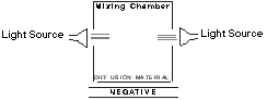
One of the lamps has a green filter in front of it and the other a blue filter (or yellow and magenta, either filtering scheme system works). Sometimes there is a third lamp that provides added light for focusing or for printing with white light on graded papers. The newer varieties of these (and certain color) heads employ new filters that do not significantly fade with time. This is a big advantage as older dichroic filters had a strong tendency to fade.
The disadvantages to these heads are few. Though the mixing chamber does a great deal to cool off the light from the enormously hot quartz-halogen lamps, it is still necessary for these heads to have built-in fans for cooling and even then — there is an occasional problem with negative popping such as that which occurs with condenser heads. It is less common, but no less of an annoyance when it does happen.
Because of the built-in fans, there is a tendency for these heads to have vibration problems. When the head is new, it is unlikely. But as it gets older, the fan tends to wear and produce substantial vibration. Check the enlarger for vibration frequently. (Instructions for doing this can be found further on in these notes.) When vibration appears, it will be necessary either to replace the fan or to install a remote fan so that the source of vibration is no longer attached to the head. There is one other stop-gap measure that can be taken.
This will shorten the life of your enlarger lamps, but is very effective if no replacement fans are available. Install a toggle switch on your enlarger that turns the fan off. This way the fan can be disengaged when making an exposure and turned on again while processing prints.
Hot variable contrast enlarging heads have been a boon to fine print making with variable contrast papers. Their many advantages far outweigh their few disadvantages. With hot variable contrast printing heads there is little or no change in exposure resulting from a change in filtration. With my Beseler head for example, I experience no significant change, even when changing from a grade 1 to grade 5 filtration. I can almost allways resume printing at the same exposure I was using prior to changing grades.
In addition, hot variable contrast heads offer extremely subtle control over exposure and contrast, with variations of contrast in as little as tenth grade steps. You’ll very quickly discover that these tiny steps are indeed quite useful.
Light output from hot variable contrast heads is also very consistent. If you make ten identical exposures in succession, you should get ten identical prints. There is no subtle increase or decrease in light output as you work. Further, most of the newer designs of this type of head contain hardware that measures the actual light output during the exposure, and adjusts the output for any discrepancies. Consistent is the word that best describes these enlarging heads.
I have worked with Beseler’s variation of this type of enlarging head for several years now and am thoroughly convinced this is one of the best possible choices, despite the occasional irritation of negative popping.
Color heads are designed much the same way described above for hot variable contrast heads, except that a third lamp is always present and the filters employed are usually cyan, magenta and yellow (seldom blue, green and red). A hot variable contrast head is really just a color head altered to special use. Because of this, a lot of people, particularly those who also print color, use a color head for printing B&W variable contrast paper.
Using a color head for this purpose has the same advantages and disadvantages mentioned above for hot variable contrast heads. However there are, one small added advantage and one or two not so small disadvantages.
When printing variable contrast paper with a standard color head the maximum contrast available when the magenta filtration is at its highest is (depending on the head) somewhat higher than the highest grade available with a variable contrast filter set or with a variable contrast head. This usually doesn’t amount to more than half a grade, but some people have found it to be a useful advantage. Personally I think this falls into the same category as the contrast increase one gets when using a condenser head rather than a cold light or diffusion head—it’s not worth the added trouble of having to deal with the other problems this type of head causes. There are two large drawbacks to using a color head for printing on B&W variable contrast papers.
First, with variable contrast heads (most) the steps between grades are set by buttons or other fixed position setting devices. When you push grade 2 for example, you know you will get exactly the same grade 2 you got when you pushed that button earlier in the day.
Color head filter dials are instead, continuously adjustable. It is almost impossible to get precisely the same filter settings from one moment to the next, no matter how careful you may be. Since making fine B&W prints involves repeated changes between grades, this can be a serious problem.
Finally, color heads have exactly the same difficulty with exposure changes resulting from changes in filtration as do variable contrast cold light heads. This means a tremendous amount of frustration determining a new exposure time every time there is a substantial change to be made in the variable contrast filtration you are using. This can be very time consuming and get in the way of the creative aspects of print making substantially.
Just about everyone uses a set of acetate variable contrast printing filters from Kodak or Ilford when they first start using variable contrast papers. This is the most economical and convenient way to start out. Among my students, one of the most common questions concerns whether to use these filters above or below the lens. A number of magazine articles have suggested that to use them below the lens is detrimental to the quality of the final image. Though this would seem to make sense in theory, I have not seen any evidence of it in practice. Both Ilford and Kodak state that it is OK to use their smaller sets of filters below the lens. I agree and recommend you use them wherever you like.
The problem of enlarger alignment has two facets. On one hand it is an important subject which should not be ignored. On the other, it makes great grist for magazine authors who are having difficulty thinking of something of significance to write about, and has therefore received much more attention in the photographic press than it deserves.
There are a number of tools available for enlarger alignment, some expensive and marginally effective, some very expensive and very effective. The bottom line is that if you need an alignment tool often enough to justify the purchase of one of these tools, you need a new enlarger much worse than you need the tool!
Here is a simple way to deal with enlarger alignment without buying expensive tools.
First, expose a piece of 35mm film (the focusing of 35mm negatives is more critical than other formats, so using 35mm film makes this technique more precise) to strong light and then develop, fix and wash it. Scratch small X’s in the emulsion side of this blackened negative, in all corners, along the sides and in the middle. You’ll have this negative a long time so be sure to store it safely.
To use, place the negative in your enlarger and focus the negative on the baseboard or easel. (Be sure to position the head at a substantial height so as to make this more effective.) With the lens aperture wide open, focus on the center scratch mark of the negative. If the corners are all sharp (unlikely), your enlarger is in alignment. If all the corners are equally unsharp, you’re still in alignment—you just need to stop down so that depth-of-field will bring the corners into focus. If some of the corners are sharp while others are not, you have an alignment problem. Are you unsure? Simple. Focus on the center mark again and print the negative on grade 4 or 5 paper with the aperture wide open. You’ll find it much easier to tell this way. Then stop down one stop and make another print. You’ll be able to tell if the corners get uniformly sharper.
If your enlarger is out of alignment, all you need is a small (pocket sized) level from your local hardware store. It is preferable that this be one that is adjustable so that you can compensate for a table or easel that is not level. The object of alignment is not to align your enlarger to the floor (who knows, your floor may not be flat, and your enlarging table quite probably isn’t!) The purpose of alignment is to make certain that your easel/baseboard, lens stage and negative stage are all completely parallel to each other. If they are all tilted ten degrees to the floor, but in unison, it doesn’t matter. They simply must be in alignment with each other.
First, place the level on your baseboard. Check that it is level from front to back and then from left to right. Next check the lens stage to see that it is level or at least is angled in the same direction as your baseboard. You may have to rest a piece of wood or a ruler on the edge of your negative stage to make measurement more reliable. Last, repeat the same steps with the negative stage. Different brands and models of enlarger offer different methods for adjusting the alignment of the negative stage and the lens stage. How you approach any problem you might detect depends largely on the design of the enlarger. Be certain the enlarger is out of alignment before making any adjustments. It is very common for the source of an alignment problem to be a photographer who was overly concerned about alignment.
The important thing to remember here is that most new enlargers do not need to be aligned and that if you are not having problems with your prints and cannot detect any problems with the test negative mentioned previously, leave well enough alone!
Fill a small glass or other container (shot glass size) half way with water. Place your enlarging head about half way up the column so that you can easily see the top of the head and place the glass of water on top. Let the water settle down for a few moments, then begin experimenting. Go through all the motions you would normally use to make a print. Open boxes (only with the lights off), place a piece of paper in the easel, turn on the enlarging timer—all the while watching the shot glass. Be sure to tap or bump into the enlarging table a few times. Do everything that might normally occur during the making of a print. You will be very surprised just how often you see the water in that shot glass move. Practice the motions of print-making this way for a while until you can confidently go through every step of the process repeatedly without producing vibration in the enlarger. You will very likely be shocked at just how much you have to change your working habits.
If you have an enlarger that incorporates a built-in fan, turn the enlarger on. If you see the water vibrate, then you may have a vibration problem produced by the fan. Virtually all enlarging heads with built-in fans will produce some vibration of the head itself. The important thing is whether or not this vibration arrives at the negative stage where it will adversely affect the sharpness of the print. Pull the negative carrier partially out of the negative stage so that enough of it protrudes from the side of the enlarger to make a platform for the shot glass. If the water still vibrates when the shot glass is at this location, then you have a fan problem that requires attention. (See previous discussion.)
Most color head and the better variable contrast head enlargers come with built-in voltage regulators. If your enlarger does not have one, you might wish to consider this purchase. Line output varies a lot from day to day and even from moment to moment. This can adversely affect your print production and even throw you off course without realizing it. Voltage regulators are fairly inexpensive and will greatly add to your printing consistency.
The quality of lens you use in enlarging makes an enormous difference in the quality of print you can expect to be able to produce. You don’t have to buy the world’s most expensive lenses, but don’t scrimp either. Putting a cheap lens on your enlarger is akin to putting bald tires on your Ferrari…not a hot idea!
Most lens manufacturers make two classes of enlarging lens. One is their economy series and almost always involves lenses containing 4 elements. The other is their standard series, usually comprised of 6 element lenses. DO NOT buy the 4 element lenses. Buy only the better 6 element lenses. They are noticeably superior. Some manufacturers have an even higher level of enlarging lenses (more costly of course). If you can afford them, fine. If not, you’ll be just fine with the 6 element crowd. Yes, lenses are expensive, but don’t give in to the temptation to save money. This is the worst possible place to do it.
There are a lot of used enlarging lenses on the market. Most of them are junk. If you don’t know exactly what you are getting and how to test it, or if you cannot return it, don’t buy it. Many older lenses are also not coated (the reflections in the surface of the lens are not colored) and will therefore produce lower contrast prints. Avoid them.
Most negative carriers are glassless. This is because glass introduces four extra surfaces into the light path — surfaces which must be kept immaculately clean. Glassless negative carriers do not hold film completely flat. For this reason, some photographers prefer the flatness control offered by glass carriers. For me, using a glass carrier is simply a way to provide your expensive diffusion head with all the drawbacks of a condenser head and none of the advantages. I never use them. However, there are some very respectable photographers out there using glass carriers. Before you buy one, use someone else’s. A lot! They are not cheap and you’ll want to be certain, after paying so much for it, that you are not going to throw it against the wall.
This is a simple topic, only because there is so little to choose from! Most enlarging easels are junk. ALL two-blade enlarging easels are junk. It seems they are out of alignment straight from the factory. They are also very tempting, because they are plentiful and cheap. Four-blade easels on the other hand are not cheap and usually have to be special-ordered.
Two-blade enlarging easels are also very lacking in versatility. If you are serious about fine print making, two-blade easels are out of the question. Fou-blade easels are the only option.
There are only two brands of four blade enlarging easels readily available. Saunders and Kostiner. Both are excellent. The Kostiner easel has a black base and is therefore a little annoying at times. The yellow base of the Saunders easel is much easier to see under safelights. The Kostiner easel is more finely engineered, but also more fragile. Close your eyes and point. You can’t make a mistake! I have and like both.
It is nearly impossible to make fine prints if you have to do all your dodging and burning while simultaneously looking at the clock! You can look at what you’re doing or you can look at the clock. You cannot do both! What you can do while looking at your print, and dodging and burning, is count. And if you have the right tool, you can count very precisely.
Don’t spend money on an expensive enlarging timer. If you’ve already done so, see if you can get a refund. Instead, buy a simple metronome (electric, not mechanical). With a metronome you don’t have to look at the clock to count seconds of dodge or burn time, you can hear the seconds tick away on the metronome. And while you’re at it, you can time your exposure with the metronome too. That way you never have to set, look at, start, stop or even own an enlarging timer. A metronome is an absolute must-have for fine print making. No matter how sophisticated the rest of your equipment, there should always be a metronome softly ticking away in your darkroom.
Half the time I focus just with my eye, the other half I use a device called a MagnaSight. The rule on focusing devices is very simple... they all work. Some however are better adapted to some people than to others. While many photographers swear by their grain focusers for example, I swear at them. I find them very annoying. If you feel you need a focusing device, examine several in actual use and buy the one with which you are most comfortable. If your prints are sharp, you made the right decision!
This is an easy topic. There are plastic, stainless steel and enamel processing trays. Don’t use enamel. They are heavy, expensive and sooner or later (usually sooner) some of the enamel chips off exposing the iron underneath. The iron will adversely react with your photographic chemicals, and will do so right now, not some day. Don’t use ’em.
Stainless steel trays are also heavy and expensive. If you can afford them and don’t mind these inconveniences, there is only one significant drawback to their use. Stainless steel is an extremely efficient conductor of heat. In practical terms this means that whatever the temperature of your developer may be initially, it will only take a few minutes for it to change very dramatically if the ambient temperature in your darkroom is very different.
Plastic trays are disposable trays! They are cheap, light weight and when stained beyond usability, they can be quickly replaced because they are very plentiful. Plastic trays make sense. Spare a tree, drill an oil well.
Oh, and make certain you have trays one full size larger than the biggest print you plan to make. Nothing is more frustrating than processing 8x10 prints in 8x10 trays!
Every public darkroom I’ve ever been in has had a bucket full of heavily stained tongs. If you’re planning on making prints larger than 8x10, you can forget tongs. You just can’t handle big, heavy fiber based paper with these. You’re going to have to get down into the developer up to your elbows with the rest of us. For small prints, you can continue to use tongs if you are more comfortable with them. From my point of view, they are simply a nuisance that often damages prints. I never use them.
However, some people are concerned about putting their hands in developer because they worry they may become allergic or may have already done so. With big prints, you still can’t use tongs because they just won’t work. Rubber examining gloves may be the only viable substitute. One student I had used a fresh rubber glove for every print he processed!
This is also a simple topic. You need both. There are anti-static negative brushes available. They don’t seem to provide any significant anti-static effect, but the brushes are good. High quality painter’s brushes (not house painters) will work well too. Use the brush to knock dirt loose from your negatives, use the air to blow it away. No, the propellant in the canned air will not damage your lenses. This is a myth.
This is a very important topic, if for no other reason than that so many darkrooms are so very UNSAFE! I have been in darkrooms that looked like the runway at the airport and their owners were completely oblivious to how their prints could be so poor. Make sure you are using the correct type of filter for the paper you are using. Every box of paper has a pamphlet inside that will tell you what type of safelight to use. Make sure your safelight filters are not old. To save money, many people buy used safelights. That’s just fine, but those used safelight filters often are not. Like other filters, the colors in safelight filters fade with time. You cannot tell by looking at them. If you know they are old, replace them. If you are uncertain, test them:
With no negative in the carrier, place a sheet of 8x10 enlarging paper on your baseboard. (No easel.) Since there is no negative in the enlarger, you will probably have to raise the enlarger head to maximum height in order to get exposures of a reasonable time. Place an ordinary ruler across the middle of the sheet of paper to block light from a section of each exposure. Expose the paper just like a step test, i.e. strips of 5 seconds, 10 seconds, 15 seconds, etc.with the ruler across the center of each strip.
Find the exposure which is the longest exposure that is still not long enough to produce an image on the paper after development. (In other words, the next step, the exposure just longer than the one you’re looking for, will have produced an image on the paper.) The purpose of the ruler is to provide a strip of completely unexposed paper through the center of each test exposure for comparison. This is because the differences will be too subtle to see without this reference point.
After you have found the maximum exposure that is still insufficient to produce an image on the paper, expose another sheet of paper for the same time. Again place the ruler through the center of the paper, but this time expose the whole sheet (except for that part under the ruler) for the exposure time just determined. Then let the paper sit on you enlarging easel in safelight illumination for another ten minutes. Be sure to leave the ruler in position.
After ten minutes, process the sheet of paper. If you can see the outline of the ruler on the paper, you have a safelight problem. Reduce illumination or buy new safelight filters, or both. Then test again. If you can remember exactly how you had the enlarger set this time, you won’t even need to run the first half of the test again, just the second.
There are a great many photographic papers available and most of the current crop, with the exception of some of those coming out of former Eastern Bloc countries (despite industry advertising to the contrary), are excellent.
Developing–out papers are what you are accustomed to using. You expose the print, then develop it out in Dektol or another developer.
Printing–out papers have almost completely gone out of existence. Sometimes referred to as sun papers, these papers visibly darken on exposure to light without the need for development. You may recall the old Kodak Studio Proof paper that had a decidedly purple color to it. Prints on these papers can be made permanent if they are treated in a fixer/toner bath after exposure. I mention them here only because they have a certain beauty of their own, and the prints are immediately recognizable to many photographers as being made on printing–out papers. There are still some private label manufacturers of these papers and they are lots of fun to play with. They also can produce some hauntingly beautiful prints.
There are three paper weights. Single, medium and double. The only medium weight papers are RC papers. These are actually single-weight papers that are thicker and heavier because of the resin coating.
Single-weight and double-weight papers are available only in fiber. Single weight papers exist for reasons of economy. They are cheaper than their double-weight counterparts. That is their only advantage. Because they are so thin, they are very easily damaged in processing, and the larger the print, the more easy it is to damage them. I consider single-weight papers to be a false economy, and recommend using only double weight papers. They are exactly the same, just thicker.
Resin coated papers are now vastly superior to what they once were. Everything about them has improved. However, compared to fiber papers, they are still junk. The best resin coated papers do not approach the depth and beauty of a fiber print, even though, as their manufacturers truthfully claim, they often are coated with the very same emulsions as their fiber based counterparts.
The reason for this is not known. I suspect it has something to do with the extreme flatness of the resin coating and the resulting very thin and flat coating of gelatin on the paper surface. I once saw a very special print made on RC paper that convinced me that paper manufacturers are telling the truth about RC papers. They do indeed have equally high quality emulsions on them.
The print to which I refer was an ordinary piece of RC B&W printing paper, save for one very important difference. There was no silver salt in the gelatin emulsion! This was a private order paper made to the exact specifications of a photographic RC paper except that no silver salt was used in the emulsion coating. A photographic image was then placed on the paper with an ink-jet printer. The resulting photograph exhibited all of the flaws usually associate with RC prints! The fact that there was no photographic silver image on the paper at any time, demonstrates that whatever the source of the apparent poor image quality in RC prints, it cannot possibly be the silver halide emulsion that manufacturers coat onto it. What are the flaws associated with RC papers?…
Blacks tend to appear weak and often seem to have a silvery mirror-like surface when viewed at the proper angle. This mirror-like appearance is very similar to what photographic conservationists refer to as sulfiding in vintage prints. It is very unattractive and makes getting blacks with real depth almost impossible with RC papers.
RC prints are veiled. That is, there appears to be a slight haze over the entire print. It is subtle, but it is there and detracts from the print. Ilford claims that their RC print dryer eliminates this veil. What little evidence I’ve seen suggests that this is true. However. at more than a thousand dollars…
RC papers are very impermanent, and for a variety of reasons. First, the resin coating itself is unstable, tending to break down and produce gases that adversely affect the print. This is particularly problematic in enclosed spaces where the concentration of gas can build up, such as… in a frame!
The natural tendency of paper is not to be very white in appearance. Therefore most photographic papers are coated with something to make them look whiter. Fiber based papers are coated with a very stable clay called baryta. Baryta sticks to fiber based papers. It doesn’t stick to RC papers. So in order to make RC papers whiter, manufacturers had to come up with something other than baryta. What they came up with was titanium dioxide. Like resin coating, this is unstable. Titanium dioxide tends to break down, turn yellow, become brittle and crack. It does these things no matter where or how you store the print.
Resin coated papers are great for making commercial prints, proof sheets, prints for magazine reproduction (although one editor I had insists that he can tell the difference between fiber and RC prints even after reproduction) and for any other purpose where quality is not paramount. I use a great deal of RC paper. I just would never consider making a serious print on it. The only thing RC has going for it is convenience. Use it when it is convenient, but never for fine print making.
Photographic magazines seem to dwell a great deal on the subject of fiber vs RC papers. Usually, it is to claim that RC papers are almost as good or have finally become just as good as fiber papers. These articles are generally written by people who use RC papers exclusively and are not sufficiently skilled printers to be able to get the best out of fiber papers. They assume that because they can’t do any better with fiber papers than with RC, that no one else can either. Usually, they are also people whose visual skills are not very well honed. Do not take their advice. RC paper is not remotely as good as fiber. If you have difficulty distinguishing the difference yourself, don’t be discouraged. Your printing skills and discrimination will improve as you become a better printer.
If you ascribe to the West-Coast philosophy of artsy photography, you eschew warm tone papers. I’ve seen lots of beautiful work done on warm tone papers and cannot think of a reason why you shouldn’t use them if you so desire. Just don’t show work on cold and warm tone papers in the same show at the same time. It looks like you can’t make up your mind.
It seems people also can’t make up their minds as to how cold and warm tone papers differ in their manufacture. I can’t think how it really makes a difference, but it is given so much coverage in the photograph literature, I might as well slay this dragon right here.
Conventional wisdom has it that cold tone papers are composed exclusively of silver-bromide emulsion, while warm tone papers have silver chloride emulsions. This is an old myth, but it just won’t die.
All photographic papers (B&W of course) are composed of a mixture of silver bromide AND silver chloride. The tone of the paper has to do with the size of the silver-halide crystals in the emulsion and the silver grains produced on development and not with the salt composition of the emulsion itself.
Warm tone papers can be quite beautiful. They are just as flexible and just as permanent as cold tone photographic papers. If you like them, use them.
This isn’t nearly the topic it was twenty or thirty years ago. There used to be an incredible variety of different base colors and textures for photographic papers. Now there are about three textures from every manufacturer, and if you’re lucky, two base colors.
Let’s deal with textures first. For serious B&W fiber based papers there are only two choices, glossy or matte. Glossy is the hands-down winner with fine are photographers. It shows the most detail and the greatest tonal range. That said, and as I do not subscribe to anyone’s church of photography, including my own, use matte if you like it!
You should know, that since glossy paper shows so much more, it is harder to print on. This means that even if you intend to use matte papers exclusively, you will learn more, a very great deal more, printing on glossy papers. Until you’ve mastered printing, stick with glossy.
Also, in my experience most matte surfaces are very unattractive. I don’t use matte papers largely because of the “almost but not quite” matte look most manufacturers opt for. Ilford’s matte surface on the other hand is gorgeous. It is a dead, flat, “we know what matte is all about” matte surface. If you prefer to print on matte papers, look at this one.
As far as base colors are concerned, there’s little or nothing to choose from any more. Your current choices are almost always limited to either bright white or cream white. The brighter the base color of the print, the more detail the print will appear to have. Cream white surfaces are usually found on warm tone papers, where they look most natural.
Though variable contrast papers are catching up fast, there is still a wider variety of graded papers available. Graded papers have been the industry standard since the last century and are still quite popular. There is no typical graded paper. They sometimes come in only one or two grades, and can also be had in a range of six grades. They are available in warm and cold tone with bright surfaces and cream surfaces. They can be had either as fiber based papers or as resin coated stock.
Unlike variable contrast papers, graded papers are still available as contact speed or enlarging speed papers. That is, contact speed papers are much slower than enlarging speed papers because they are intended to be printed in contact with large negatives under bright light. These are usually quite beautiful papers, but are useless for enlarging. Platinum papers and most turn-of-the-century processes experiencing revival of late, are contact speed papers.
Variable contrast papers were first introduced in the 1930’s. At the time, they were considered by most to be awful. Some people still think they’re awful! Fortunately they are wrong. Modern variable contrast papers are as good or better than any of their graded counterparts and have some very decided advantages.
I started printing on variable contrast papers while in Peru and will never go back to graded papers, except of course for that rare occasion when I need a particular characteristic that is simply not available in variable contrast papers.
Variable contrast papers allow for a broader range of interpretations of a negative than graded papers can begin to approach. Graded papers for example, differ in contrast considerably from one grade to the next . Achieving subtle between-grades contrast changes with graded papers, though possible through the use of specially formulated developers, is at best tedious. For practical purposes, graded papers are limited to the rather larger jumps in contrast from one grade to the next.
With variable contrast papers on the other hand, adjustment of contrast between grades is infinitely variable, literally with the push of a button. The ham-fisted half grade step filters that often accompany introductory promotional packaging of variable contrast papers belie the fact that the contrast of variable contrast papers is infinitely adjustable between the extremes of which the paper is capable and in fact, applying the concept of paper grades to variable contrast papers really serves no purpose at all other than to employ terminology with which the photographer is already familiar.
In addition to being able to print on a paper of grade 2+7/10 for example, VC papers also allow us to use two or more different grades of contrast on the same sheet of paper, something completely impossible with graded papers no matter how exotic the techniques employed. Why would you want to do that?
Simple, negatives often exhibit substantial differences in local contrast from one area of the image to another. (See "The Primacy of Local Contrast") These differences result in a situation where one part of the negative may look best printed on one grade of paper, while another section of the negative produces a superior look when printed on another paper grade. With graded papers, we are forced to sacrifice one area in order to save the other. With a variable contrast paper, each section of the negative can be printed through a different filter, thereby substantially improving the print.
It is important to know how variable contrast papers work, if only because misinformation in the photographic literature is so common.
It is widely believed that variable contrast papers are coated with two separate emulsions, one high-contrast and the other low-contrast. The high-contrast emulsion is thought to be sensitive to blue light while the low-contrast emulsion is sensitive to green. None of this is accurate.
The logistics of paper manufacture aside, for practical purposes, variable contrast papers are composed of only one emulsion—all of which has the same contrast. How then is variable contrast achieved? Simple…
Half of the emulsion is sensitive to blue light only. The other half is sensitive to both blue and green light. When a variable contrast paper is exposed through a magenta (high-contrast) filter it is in effect exposed to blue light. (Magenta is a mix of blue and red. Since VC papers are not sensitive to red light, from the viewpoint of the paper, the exposing light is only blue.) Since both halves of the emulsion are sensitive to blue light, both are exposed and an image of relatively higher contrast is produced.
In the case of exposure through a yellow filter (low-contrast), the emulsion is effectively exposed to only green light. Yellow you no doubt recall is composed of a mix of green and red. As above, the red has no effect because variable contrast emulsions are not sensitive to red light. But half of a variable contrast emulsion is sensitive to the green component of the light passing through a yellow filter. The other half, being sensitive to blue light only is not affected. Since only half of the variable contrast emulsion is exposed through a yellow filter, the net effect is lower contrast.
Designing variable contrast emulsions this way allows for greater flexibility and more uniform behavior. Early variable contrast papers used both high and low contrast emulsions (hence the current myth) and because of this, didn’t behave very well. The single contrast, single emulsion approach works much better and is used in all of the variable contrast papers we see today.
If you’re reading this or any other of my articles, you probably care very little for the technical side of photography except as it serves you to make better photographs. Photographic magazines are jam-packed with articles on paper grades, and comparisons of grading scales from one manufacturer to the next, etc. These may be interesting articles, but as the subject of paper grading isn’t likely to help us make better photographs, it is of no genuine use to us.
One manufacturer’s grade 2 paper can be, and often is, very different in contrast from another’s. Even grade 2 papers from the same manufacturer vary considerably from one paper type to the next. There is an internationally accepted rating system of course, but few manufacturer’s pay much attention to it. Variable contrast papers differ even more than graded papers. A grade 5 in a variable contrast paper may be no higher in contrast than a # 3 graded paper.
From the standpoint of making a fine print, the actual grade of the paper on which you are printing has no importance whatsoever. As long as you are getting what you need from a particular paper, who cares what its grade might be. Likewise, if you change from a grade 2 to a grade 5 filter and get the result you want, you obviously don’t care in the slightest if that grade 5 filter in reality only produced grade 4.
We should think of paper grades as nothing more than a rough scale that provides an approximate indication of what to expect. More may be needed by those of us who write articles for photo magazines, but not by those who simply need to produce high quality images.
Please, PLEASE!!! Do not fall into the trap suggested so often in the photographic press, of testing your printing papers. It is bad enough that we take time to test film. To consider testing papers too is the height of foolishness.
The excuse provided by those authors guilty of recommending that you test papers is that we must know the exposure scale of the paper we are going to use so that we can match the density range of our negatives to that exposure scale. This is exceedingly flawed logic. Seldom is a fine print made on a paper, the exposure scale of which matches the density range of the negative. When it does, it is by coincidence rather than design. We print a negative on the paper that renders it best and not on the one that happens to match its density range. Knowing this, and you will know it by the end of my Fine Print workshop, it becomes very obvious that paper testing is pointless.
This does not mean however that knowing something about the paper on which you are printing isn’t helpful. But what you need to know, you can find out from the manufacturer. One of the most important things to know is whether the paper is a long-toed or short-toed paper. If it is long-toed, it will render highlights with lower contrast than a short-toed paper, but shadows will be higher in contrast. With short-toed papers, the reverse is true.
The best way to become acquainted with the characteristics of papers is to print the same negative on the different types of paper you expect to use. Attempt to match approximate contrast between papers (this is a lot harder than it sounds) and then note the subtle differences in rendition from paper to paper. This will provide you with far more useful information that any step-wedge testing or characteristic curve drawing ever could.
You’re no doubt familiar with the effects of reciprocity failure on films. This also happens with papers, but in a somewhat different manner.
Films start to experience reciprocity failure with exposures longer than about a half-second. Papers don’t experience any reciprocity failure until exposures become longer than about 60 seconds. While films increase in contrast with long exposures, papers do not. They simply lose speed. All you need to know is that when your paper exposures are longer than 60 seconds, in order to get the equivalent of a 10 second increase in exposure you may have to instead add 15 or 20 seconds.
For the most part, what I’m talking about here is B&W resin-coated paper (color too, if you care). To my knowledge there is little problem with latent image stability in fiber-based papers (and none of any significance with film). With RC papers this problem was particularly significant in the 70’s and 80’s. Since then, Kodak and other manufacturers have improved the situation considerably.
In the early 80’s, I remember that if I waited 60 seconds after exposing a sheet of RC paper, and before immersing it in the developer, it would lose considerable density compared to an identically exposed print for which I had not delayed development. This was a real problem because it meant that two prints made in rapid succession would nonetheless be different in appearance due to the extreme latent image instability.
Modern RC papers suffer from this problem much less (watch out for those papers coming out of Eastern Europe), but you must still keep your eyes open. Try holding on to one or two prints for 5 or 10 minutes before processing, then compare them to an identically exposed print processed right away. If there is a difference, you may have a problem.
You already know that if you prolong the amount of time your film is in developer, its contrast will increase. Similar claims are made for paper from time to time. None of them are true. Extending the time your paper is left in the paper developer will not increase its contrast in any way. It will only increase the overall density. In other words, it is just like having exposed the paper for a longer period of time. If your paper exposure is already quite long and you are facing reciprocity failure difficulties, extending development time of your paper may be a useful tool. If you want more contrast however, you’ll have to find some other way to do it.
Within a limited range, changes in the temperature of a paper developer affect only the rate at which development occurs. Leaving the print in the developer for a longer or shorter time will exactly compensate for the differences in temperature. However, if the temperature is low enough, the activity of different components of the developer slow disproportionately and simply lengthening development time will no longer adequately compensate. Try to keep the temperature of your paper developer above 55° F. Aside from that you can allow it to shift significantly. (See Factorial Development later in these notes.)
There are substantial differences in the visual appearances of papers. Photographic papers are certainly NOT all the same. However, most often, when a print looks bad, it is the fault of the photographer, not the paper. For this reason I hesitate to include this topic at all. But you should know that sometimes a negative will look much better printed on one type of paper as opposed another. Papers simply have different characteristics, most of which cannot be easily, or at all, quantified. The differences are just there.
You should have a stable of two to four papers on which you like to print. When a negative just isn’t working out well on one paper, it doesn’t hurt to try a different one.
Paper development is quite different from development of film. The development of film for example, can be foreshortened or lengthened to considerable benefit. Development of paper cannot. The development of B&W photographic papers is always carried to completion. That is, when the paper is pulled from the developer, it is already at its maximum contrast and also very close to its maximum density. Shortening the time of development for papers produces disastrous and unusable results, while lengthening the time produces no improvement or significant change, other than a moderate increase in effective paper speed.
It is also virtually impossible for B&W paper to be unevenly developed. This is because of the higher contrast of B&W papers and paper developers, and the development to completion mentioned above.
Are paper developers all the same? No they are not, but from a practical standpoint, there is very little difference indeed from one to the next. Some paper developers are slightly lower in contrast than others, some are a little higher. If you are trying to get subtle between-grades contrast changes out of graded papers, these differences in paper developers can be very useful. Many photographers for example, will have a tray of Dektol and a tray of Selectol Soft in the darkroom sink so that they can adjust contrast by splitting development of a print for varying amounts of time between the two trays. I worked this way for a long time. It is effective, but marginally so. Otherwise the differences between paper developers are of little consequence as you can raise or lower contrast simply by changing paper grades or variable contrast filters. Claims for paper developers of “deeper blacks” or “richer tones” are all just marketing nonsense. The same is doubly true for developer “additives.”
The paper developer I use is Dektol. It is a bit of a nuisance to mix, but is very consistent and long-lasting. The liquid variety of Dektol is Ektaflo Type 1 which is sold in 1 gallon cubes. It is just as good as Dektol, but the concentrate tends to go stale fairly quickly once you’ve opened the cube. A stock solution of Dektol seems to last much longer.
You need to know a little something about the composition of paper developers and other paper processing chemicals in order to use them to their fullest potential.
There are a variety of chemical components in paper developers. The one that does the actual development of the latent image is the developing agent. The most commonly used developing agents are Metol (called Elon if Kodak makes it) and Hydroquinone. These are usually used in combination with each other, as their cumulative effect is superior to what either can produce on their own. Some other developing agents are Phenidone, Amidol, Glycin and Pyro.
Beyond the ability to recognize these names as being the names of developing agents, there is little more you need to know about them. You’re not likely to want to compound your own, and if you’re tempted to do so, let me be the first to discourage you. I’ve never seen the slightest quantifiable benefit to be had from roll-your-own paper developers, all the books and magazine articles to the contrary notwithstanding, though I‘d certainly like to be proven wrong.
If you have developed or are concerned about developing an allergy to paper developer, the likely culprit is Metol. It’s in the vast majority of film and paper developers commercially available and is by far the most allergenic. Should you develop such an allergy, it will only get worse, even if you use tongs and gloves. Eventually, just being in the same room with it will get to you. Fortunately there is an alternative.
Phenidone is almost identical to Metol in its development behavior, but is not notably allergenic. Ilford makes both film and paper developers that employ Phenidone (Not all of them! Ask first.) instead of Metol. Just switch to these and you should be fine. If for some reason you can’t find them, it might be time to consider mixing your own developers after all. To my knowledge, all developers containing Phenidone proudly say so on the container. They know when they have a good thing.
Just as there are warm tone and cold tone papers, so are there warm and cold tone paper developers. No, you cannot develop a cold tone paper in a warm tone paper developer and get brown prints—you’ll just get the same tone you’d have gotten with the cold tone developer. But if you are using a warm toned paper, you can alter the degree of coloration substantially by your choice of developer. Warm tone developers are designed to provide the greatest “warmth” (read “brown tone”) with warm tone papers. With cold tone developers, warm tone papers give a much less brown colored image, though it is still decidedly warmer t£han cold tone papers.
Developing agents tend to go bad FAST. They oxidize very quickly and become useless. That is why paper developers include a chemical called a preservative. This preservative is almost always, sodium sulfite. With sodium sulfite in the mix, paper developers last a lot longer. Aside from its action as a preservative, sodium sulfite serves no other significant purpose in paper developers. (It does in film developers.)
All the developing agents mentioned above are largely inert unless they are in the presence of an alkali. If the solution they are in is acid, they do not function as developers at all. If dissolved in plain water, any developing agent will eventually do its job, though it would take hours or even days. But if the water is alkaline, the process is substantially…well, accelerated.
The alkali almost always used in paper developers is sodium carbonate. (NO, that is NOT bicarbonate of soda!) In order to work efficiently and consistently the level of alkalinity in a paper developer must remain consistent. It cannot grow progressively less alkaline as the developer is used. For this reason, the alkaline accelerator in paper developers is buffered That is to say, as the alkali is used up by the developing agent, it is replaced by fresh alkali so that the alkalinity (pH in chemical jargon) remains the same. In a properly formulated paper developer, the alkalinity will remain more or less consistent until the developer is very near exhaustion.
Interestingly, if you were to spill some acid stop bath into your paper developer, assuming it was not a great amount, it would have no effect on the performance of the developer, save to shorten its useful life. Prints developed before and after the spill would appear identical. This is because the sodium carbonate in the developer would neutralize the acid and be immediately replaced by the buffer, leaving the alkalinity of the bath the same as it was before.
The foregoing is more than just an interesting technical point. It is actually useful information. The next time someone suggests to you (and they will) that adding a chemical compound to your paper developer will improve its performance, particularly with regard to increasing contrast or density, you’ll have ample reason to be suspicious of such a claim. VERY suspicious. In fact, if you can get them to bet money…
The problem with all developers is that they don’t want to develop just the silver-halide crystals you’ve exposed to light. They also want to develop all the unexposed crystals. The rate of development of unexposed crystals is very much slower than that of exposed crystals and therefore, by the time the exposed image is reasonably well developed, very little of the unexposed silver halides have been developed. This is referred to as developer fog and a small amount of it is acceptable with film, but no amount is acceptable at all with paper. So paper developers include a chemical that discourages the development of unexposed silver halide crystals. These chemicals are call restrainers and for practical purposes there are only two.
Potassium bromide is the most common restrainer used in both film and paper developers. It is cheap and very effective. It also has a tendency to give B&W prints a slightly greenish cast, but this is unimportant in most prints, particularly if you are going to tone them anyway. Potassium bromide has a tendency to reduce paper speed a bit and therefore must be used sparingly.
Benzotriazole, also known as Kodak Anti-Fog #1 is another common restrainer. It is much more expensive than potassium bromide but does not cut paper speed at all and also doesn’t produce a color cast. It is supplied by Kodak in tablet form, which must be crushed and then dissolved in water. To call this a “pain” is to put it mildly. If you must add restrainer to developer, use potassium bromide. Why would you want to do this?
If you happen to be using old paper with an increased tendency to fog, adding restrainer to your paper developer might help prevent it. Other wise, there is never a reason to add restrainer to your developers. It is always included in ideal proportions at the factory.
Most resin coated B&W photographic papers are developer-incorporated papers. This means that at the time the paper is manufactured, the factory puts a developing agent in the emulsion along with the standard components of the silver halide emulsion. You will recall from our discussion above that in order for a developing agent to work, it must me in the presence of an alkali. Since there is no alkali included in the emulsion, the developing agent remains dormant. When you drop a sheet of this paper into a tray of developer, the alkali in the tray activates the developer in the paper’s emulsion.
Since the developer is already inside the emulsion and in substantial quantities, development proceeds very quickly… this explains why most RC papers develop so much faster than fiber papers.
A few RC papers do not have developer incorporated into their emulsions. They develop more slowly, like fiber based papers. How can you tell the difference? Simple, manufacturers treat the absence of developer incorporation as an asset and will therefore make a point of advertising it to you somewhere on the paper box.
This subject is easy— No, you should never use plain water unless you want your prints to be inconsistent and your fixer not to last as long. If you use water, every trip from the developing tray to the stop tray carries over more developer and therefore more sodium carbonate into the water stop. With each print you process, you are making the water more alkaline and therefore increasing the degree to which development continues in the water! Eventually, that tray of water isn’t water at all. It’s weak developer!
If your stop bath is plain water, it means you are carrying an alkaline print into an acid fixer (fixers are acidic). Since there was no acid in your stop tray to neutralize the developer, the acid in the fixing tray must do it for you. This means that your fixer will become exhausted sooner, and that it won’t work as efficiently.
You must also not prepare stop bath by just pouring acid into a tray of water. Measure the water and acid exactly, according to instructions. If you mix stop bath haphazardly you risk either having an inefficient stop bath if you do not put in enough acid, or if you put in too much acid, disaster…
Fixer needs to be acidic up to a certain point and no more. If fixer is too acidic, it becomes REDUCER! In other words, it eats your photograph. If you carelessly dump too much acetic acid into your stop bath tray, you will carry this overabundance of acid into your fixer with every print you process. Eventually the fixer will be so acidic, it will actually destroy the lightest tones in your print while it is also fixing it! ’Nuff said about stop bath!
I know of no one who mixes their own fixer. It just isn’t economical because commercial fixing baths are so cheap and the do-it-yourself variety is such a pain. I also don’t know of any commercial fixing baths that can be described as “bad.” Just make sure the variety you think you’re using is really the one you are using. Kodak’s liquid Kodafix for example is really a rapid fixer, despite the fact that nowhere on the bottle or in Kodak’s literature does it let you know that.
The subject of toning could easily fill several volumes. Most of it fortunately can be immediately discounted as useless information by serious fine art photographers. The reason for this is that the vast majority of print toners are either dangerous to the longevity of the photograph, OR TO YOURS! Since you’re not going to employ a toner that can kill you or your photograph, it is safe to ignore most toners forever.
In order for a toner to be worth consideration for fine art photographers, it must be safe, it must add to the aesthetic quality of the photograph and it must add to the image permanence of the photograph.
Safe needs no further explanation.
Neither does—adding to the aesthetic quality.
But why MUST a toner add to the permanence of an image? Why can’t it just be enough that the toner doesn’t detract from it?
Because silver-based B&W photographs are not especially stable. At least not compared to what they can be. The silver in a B&W photograph is subject to oxidation, and deterioration from exposure to pollutants in the air. This is one of the reasons old B&W photographs that have not been toned have a “silvery,” mirror-like appearance on their surfaces. Some of the silver in the image has oxidized and migrated to the surface (this is called sulfiding). Toning a photograph with the proper toner not only adds to the beauty of the photograph, it can very substantially (i.e., by centuries) add to the permanence of the image. There are plenty of good toners out there that add significantly to the permanence of a photograph. Therefore it would be the height of foolishness to use one that does not.
The toner favored by most fine art photographers is selenium. For practical purposes this is available only from Kodak. It is relatively inexpensive, largely non-toxic and a snap to use. (Don’t use it in an unventilated room, and NEVER try to make your own. In order to make selenium toner, metallic selenium must be boiled. The fumes from that boiling are EXTREMELY poisonous.)
Everyone has their favorite dilution, but the most common approach is to mix selenium with water 1:10. Treat the print in the toner until you are pleased with the tone. (Complete instructions for this are contained in "Fixing, Washing and Toning Fine B&W Photographs" and therefore will not be covered in more detail here.)
Almost all of the other toners that are safe for photographs are brown toners or sepia toners of one type or another. There are a great many of them. Most of them you will have to mix yourself. Kodak sells several pre-packaged varieties. There are plenty of books out there that list literally hundreds of toner formulas of this class. If you are interested in exploring the great variety of brown tone toners, there is certainly plenty of information.
This is far too broad a topic to go into any further here and since the only type of toning I teach in my workshops is selenium toning (No, I don’t think there’s anything wrong with other toners. It’s just that we can only do so much in one week!), this is a good place to end this section!
This is a subject you’ll run into VERY often. Stated simply: the term dry-down comes from the observation made by many photographers that B&W prints look darker when they are dry than they do when they are wet. Just about everyone notices this when they first start making photographs. You might also like to know that some people have made a considerable amount of money selling devices intended to compensate for this effect.
In my humble opinion (fortunately I’m not the only person who thinks this), there really is no such thing as dry down. What people see as dry-down is simply a highly reflective, wet print surface which, because it is swollen with water, reflects more detail in the darker parts of the image. If you want to get rid of the dry-down problem without spending hundreds of dollars on equipment of dubious merit, just remember never to judge a print without thoroughly squeegeeing off all of the surface water first. Since I got into this habit (and started to question the concept of dry-down, I’ve had no problem at all.)
Previously I mentioned that there was a way to compensate for variations in the temperature of your paper developer, as long as the range of temperatures remained within a reasonable scope. This same method will also compensate for the slowly diminished efficiency of your developer as it nears exhaustion. In fact, factorial development is so efficient and reliable that not to use it is to make extra work for yourself for no particular reason.
Factorial development originated with the observation (not mine) that there is a consistent relationship between the moment when an image first begins to appear (visually) in the developer and the moment when development is complete (or at least reaches a known point)—and that this relationship remains consistent throughout the practical life of the developer. Would you like that in more practical terms? I thought so…
Let’s assume that your standard time of development for a given paper is 3 minutes. Each print that you make will have an emergence time. This is the delay in seconds, between the moment when you first immerse the print in developer until the instant when the first hint of image begins to appear in a print. With RC papers, emergence times for well-exposed prints hover around 10 seconds. With fiber papers, emergence times range from 20–30 seconds.
If you divide your development time in seconds by your emergence time, the result is called the development factor. Assuming your development time is 3 minutes and your emergence time is 30 seconds: 3 minutes or 180 seconds divided by a 30 second emergence time gives a factor of 6. Once you have established that factor, and assuming of course that you are working on the same print, as your developer ages or its temperature shifts, the emergence time will change. The factor however remains the same. If you notice for example that emergence is now delayed by an additional 10 seconds, making your new emergence time 40 seconds, simply multiply that 40 second emergence time by your established factor (6) to get a new development time (240 seconds or 4 minutes) which will give you exactly the same degree of development you got from 3 minutes development when the emergence time was only 30 seconds.
This works extremely well and is reliable. Here are some precautions:
In the early stages of making a print, determining a factor is a waste of time because you will still be making major changes to exposure. The factorial method relies on consistent exposures from one print to the next. Therefore it is only useful when you want to make several identical prints in a row or when you are nearing a final print and your base exposure and major burns are already established and will remain the same from print to print with only minor alterations in parts of the print you are not using to determine emergence time.
Don’t use the very first hint of appearing image as a basis for emergence time. Instead choose a Zone V or VI midtone, preferably one adjacent to a substantially lighter or darker area of the print so that it is easier to be certain when the exact moment of emergence occurs. Try to use a part of the print that receives little or no dodging or burning, so that you can be assured of greater print-to-print exposure consistency in that area. This technique is easy to apply, but does require a little experience. Practice with multiple copies of images you’ve manipulated little or not at all, and with fresh developer and careful temperature control. This way you’ll know that your emergence time ought to be consistent from print to print, allowing you to see where and how you make errors and how to correct them. You’ll quickly master this technique and once you do, you’ll use it all the time.
Making a fine print often means working the entire day, or even two, with developer that is slowly becoming exhausted. Just when you’ve finally reached the print you want, it is very likely your print developer will be going bad and as you continue to make prints, they will be progressively off target. Of course you can’t use fresh developer in this case because that would immediately make your exposures far more effective, producing a much denser print than you had achieved just prior to changing developer.
Enter the factorial method. If you are using it, you can easily compensate for your developer going South and can even change to fresh paper developer, picking up right where you left off. This is a wonderful tool. Learn to use it and you’ll be glad you did.
There are a variety of topics contained in the lecture portion of my Fine Print workshop that are not covered here because they either have to be dealt with face-to-face in the workshop, or they are covered thoroughly in another article you will have received as part of your pre-workshop preparation packet. Some of these topics are:
The Primacy of Local Contrast
Dodging & Burning
Flashing & Localized Flashing
Overall & Local Selenium Intensification
Dye Dodging
Using SLIMT’s with Paper
1997
David Kachel